

Features
Penguai can teach you Javascript
Learning JavaScript doesn't need to be difficult. Our penguin AI robot can learn how much you know and will go at your speed.
A flexible container that groups related content and actions — products, articles, testimonials, pricing, and more.
Learning JavaScript doesn't need to be difficult. Our penguin AI robot can learn how much you know and will go at your speed.
@card.Card(card.Config{
    Image:       "/assets/images/cards/card-img-1.webp",
    ImageAlt:    "A penguin robot talking with a human",
    Tag:         "Features",
    Title:       "Penguai can teach you Javascript",
    Description: "Learning JavaScript doesn't need to be difficult...",
})TitlePrefix places an icon beside a wrapping title.
Your application description.
@card.Card(card.Config{
    Title: "Application",
    TitlePrefix: icon.Icon(icon.Config{
        SpriteURL:   heroicons.SpriteURL,
        Symbol:      heroicons.Icon16SolidCube,
        Decorative: true,
    }),
    Description: "Your application description.",
})Pass any templ.Component as Footer to add actions below the body.

Relax under the sun, savor delicious cuisine, and create memories that last a lifetime. Book your getaway now.
Pass a templ.Component as Body for lists, activity, metadata, or any application-owned content between Description and Footer.
Changes from the last 24 hours.
@card.Card(card.Config{
    Title:       "Recent activity",
    Description: "Changes from the last 24 hours.",
    Body:        activityList(),
    Footer:      activityFooter(),
})Use InteractionPressed for whole-card links that should feel physically pressable. Media accepts any templ component, so project art can cross card regions without turning the Card API into an image-layout DSL.
<a href="/projects/atlas" aria-label="Explore Atlas">
    @card.Card(card.Config{
        Media:       projectPreview(),
        MediaClass:  "h-64",
        Tag:         "Go UI",
        Title:       "Atlas",
        Description: "Server-rendered interfaces for durable applications.",
        Interaction: card.InteractionPressed,
    })
</a>Set Layout: card.LayoutHorizontal to place the image beside the content instead of above it.

Experience the next level of augmented reality with smart goggles integrating cutting-edge AI for seamless interaction with the world around you.
@card.Card(card.Config{
    Layout:      card.LayoutHorizontal,
    Image:       "/assets/images/cards/card-img-4.webp",
    Tag:         "Artificial Intelligence",
    Title:       "AI-Powered VR Goggles Redefine Reality",
    Description: "Experience the next level of augmented reality...",
})An e-commerce recipe: compose a bordered article with rating.RatingDisplay, a price, and an Add to Cart button. Price and rating are application content, not Card config fields.
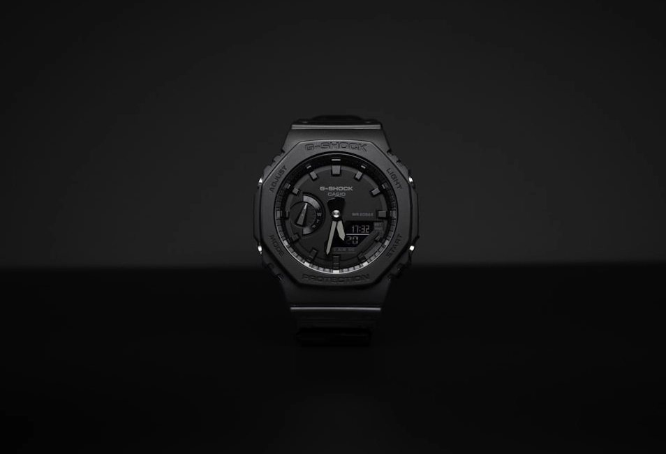
The Casio G-Shock GA2100 is simply designed for easy timekeeping, featuring a sleek profile and clear display.
<article class="group flex rounded-radius max-w-sm flex-col overflow-hidden border border-outline bg-surface-alt ...">
    <div class="h-44 md:h-64 overflow-hidden">
        <img src="/assets/images/cards/card-img-3.webp" alt="CASIO G-SHOCK GA2100" />
    </div>
    <div class="flex flex-col gap-4 p-6">
        <h3 class="text-lg font-bold">CASIO G-SHOCK GA2100</h3>
        @rating.RatingDisplay(rating.DisplayConfig{Value: 3, Size: rating.SizeSM, Label: "Rated 3 stars"})
        <span class="text-xl font-medium">$99.99</span>
        @button.Button() { Add to Cart }
    </div>
</article>A pricing recipe using the primary border accent and a full-width CTA. Composed as a custom article.
Best tools for productivity
$8.99 Per month<article class="group flex rounded-radius max-w-xs flex-col overflow-hidden border-2 border-primary bg-surface-alt p-6 ...">
<span class="ml-auto w-fit rounded-radius bg-primary px-2 py-1 text-xs text-on-primary">TOP CHOICE</span>
<h3 class="text-xl font-bold">Premium</h3>
<span class="mt-8 text-3xl font-medium">$8.99</span>
<ul class="mt-4 list-inside list-disc space-y-2 text-sm">...</ul>
@button.Button(button.WithRootClass("w-full")) { Start your free trial }
</article>A quote recipe pairing a person, role, and rating.RatingDisplay in the footer row.
Simply put, this software transformed my workflow! Its intuitive interface and powerful features make tasks a breeze. A game-changer for productivity!

<article class="group rounded-radius flex max-w-md flex-col border border-outline bg-surface-alt p-6 ...">
    <svg class="size-12">...</svg>
    <p class="mt-2 text-sm">Simply put, this software transformed my workflow!...</p>
    <div class="flex mt-8 justify-between gap-6">
        <div class="flex items-center gap-2">
            <img src="/assets/images/avatars/avatar-1.webp" class="size-10 rounded-full" alt="Bob Johnson" />
            <div><h3 class="font-bold">Bob Johnson</h3><span class="text-xs">CEO - TechNova</span></div>
        </div>
        @rating.RatingDisplay(rating.DisplayConfig{Value: 4, Size: rating.SizeSM, Label: "Rated 4 stars"})
    </div>
</article>The examples above cover behavior and composition. pkg.go.dev is the canonical reference for exported types, functions, methods, and Go documentation.
github.com/araihu/goshtoso/components/cardGoshtoso can store preferences and demo state in your browser. Some examples use cookies and IndexedDB to persist local demo state. There is no analytics, advertising, or third-party tracking. You can use the site without storage, but preferences and some examples will reset or stop persisting. Details in our Privacy Policy.