
Getting Started
Start with a complete dog-breeds app built with Go + Templ + HTMX + Alpine.js. Clone it, run it, then read how it works.
Learn the component model
Read the Component Model to learn the common component interface, concrete return values, constructor styles, stable Kind identity, and rendered defaults.
Expected outcome
This is the starter app's table running inside the docs. Try search, filtering, sorting, and pagination.
Breed | Group | Origin | Size | Temperament |
|---|---|---|---|---|
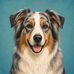 Australian Shepherd Herding | Herding | USA | Medium | Active |
 Beagle Hound | Hound | England | Small | Curious |
 Border Collie Herding | Herding | Scotland | Medium | Smart |
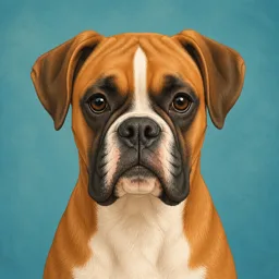 Boxer Working | Working | Germany | Large | Energetic |
 Bulldog Non-Sporting | Non-Sporting | England | Medium | Calm |
Use the starter repo
The starter includes the Go server, templ page, generated templ output, and dog images.
git clone https://github.com/araihu/goshtoso-getting-started dog-breeds
cd dog-breeds
go run .
# Open http://localhost:3000
How assets work
Goshtoso runtime assets
CSS, themes, Alpine.js, HTMX, fonts, and library artwork are served from
/assets/byassets.Handler().Starter app assets
Dog images live in
assets/dogs, are embedded with Go, and are served by the starter app from/dog-images/.
Build it manually
The starter repo is the fastest path. The walkthrough below shows the moving parts if you want to build the same app from scratch.
1. Create your project
mkdir dog-breeds && cd dog-breeds
go mod init dog-breeds
go get github.com/a-h/templ@latest
go get github.com/araihu/goshtoso@latest
2. Create the page template
page.templ renders the table and loads Goshtoso's runtime dependencies.
package main

import (
	"github.com/araihu/goshtoso/components/head"
	"github.com/araihu/goshtoso/components/table"
)

// Page renders the dog breeds page using the Goshtoso table component.
// Filtering, sorting, and pagination are all built into the component —
// just configure them via table.Config.
//
// Assets (CSS, Alpine.js, HTMX) are served from /assets/ via the embedded
// assets.Handler() — no CDN needed, works fully offline.
templ Page(cfg table.Config) {
	<!DOCTYPE html>
	<html lang="en" data-theme="araihu" x-data x-init="document.documentElement.dataset.theme=localStorage.theme||'araihu'">
		<head>
			<meta charset="UTF-8"/>
			<meta name="viewport" content="width=device-width, initial-scale=1.0"/>
			<title>Dog Breeds — Goshtoso Getting Started</title>
			<!-- Goshtoso runtime assets: CSS (themes) + Alpine + collapse/focus + HTMX.
			     Served from /assets/ by assets.Handler() (mounted in main.go) — no CDN. -->
			@head.Dependencies()
			<link rel="stylesheet" href="/araihu.css"/>
			<!-- darkmode.js drives the theme/dark toggle; not part of Dependencies(). -->
			<script src="/assets/js/darkmode.js"></script>
			<style>[x-cloak] { display: none !important; }</style>
		</head>
		<body class="min-h-screen bg-surface text-on-surface dark:bg-surface-dark dark:text-on-surface-dark">
			<div class="max-w-5xl mx-auto px-6 py-12">
				<h1 class="text-3xl font-bold font-title mb-2 text-on-surface-strong dark:text-on-surface-dark-strong">Dog Breeds</h1>
				<p class="text-on-surface-muted dark:text-on-surface-dark-muted mb-8">
					A filterable, sortable, paginated table built with
					<a href="https://github.com/araihu/goshtoso" class="underline text-primary dark:text-primary-dark">Goshtoso</a> —
					Go + Alpine.js + Tailwind CSS + Templ + HTMX.
				</p>
				@table.Table(cfg)
				<p class="mt-6 text-xs text-on-surface-muted dark:text-on-surface-dark-muted text-center">
					Built with <a href="https://github.com/araihu/goshtoso" class="underline">Goshtoso</a>
				</p>
			</div>
		</body>
	</html>
}
3. Create the server
main.go mounts Goshtoso runtime assets, serves embedded dog images, renders the page, and returns HTMX table fragments.
package main

import (
	"embed"
	"fmt"
	"io/fs"
	"log"
	"net/http"
	"sort"
	"strconv"
	"strings"

	"github.com/araihu/goshtoso/assets"
	"github.com/araihu/goshtoso/components/table"
)

// Dog represents a dog breed with metadata
type Dog struct {
	Breed       string
	Image       string
	Group       string
	Origin      string
	Size        string
	Temperament string
}

var breeds = []Dog{
	{Breed: "Labrador Retriever", Image: "/dog-images/labrador-retriever.webp", Group: "Sporting", Origin: "Canada", Size: "Large", Temperament: "Friendly"},
	{Breed: "German Shepherd", Image: "/dog-images/german-shepherd.webp", Group: "Herding", Origin: "Germany", Size: "Large", Temperament: "Loyal"},
	{Breed: "Golden Retriever", Image: "/dog-images/golden-retriever.webp", Group: "Sporting", Origin: "Scotland", Size: "Large", Temperament: "Gentle"},
	{Breed: "French Bulldog", Image: "/dog-images/french-bulldog.webp", Group: "Non-Sporting", Origin: "France", Size: "Small", Temperament: "Playful"},
	{Breed: "Bulldog", Image: "/dog-images/bulldog.webp", Group: "Non-Sporting", Origin: "England", Size: "Medium", Temperament: "Calm"},
	{Breed: "Poodle", Image: "/dog-images/poodle.webp", Group: "Non-Sporting", Origin: "Germany", Size: "Medium", Temperament: "Intelligent"},
	{Breed: "Beagle", Image: "/dog-images/beagle.webp", Group: "Hound", Origin: "England", Size: "Small", Temperament: "Curious"},
	{Breed: "Rottweiler", Image: "/dog-images/rottweiler.webp", Group: "Working", Origin: "Germany", Size: "Large", Temperament: "Confident"},
	{Breed: "Dachshund", Image: "/dog-images/dachshund.webp", Group: "Hound", Origin: "Germany", Size: "Small", Temperament: "Clever"},
	{Breed: "Yorkshire Terrier", Image: "/dog-images/yorkshire-terrier.webp", Group: "Toy", Origin: "England", Size: "Small", Temperament: "Spirited"},
	{Breed: "Boxer", Image: "/dog-images/boxer.webp", Group: "Working", Origin: "Germany", Size: "Large", Temperament: "Energetic"},
	{Breed: "Siberian Husky", Image: "/dog-images/siberian-husky.webp", Group: "Working", Origin: "Russia", Size: "Medium", Temperament: "Outgoing"},
	{Breed: "Shih Tzu", Image: "/dog-images/shih-tzu.webp", Group: "Toy", Origin: "China", Size: "Small", Temperament: "Affectionate"},
	{Breed: "Border Collie", Image: "/dog-images/border-collie.webp", Group: "Herding", Origin: "Scotland", Size: "Medium", Temperament: "Smart"},
	{Breed: "Doberman", Image: "/dog-images/doberman.webp", Group: "Working", Origin: "Germany", Size: "Large", Temperament: "Alert"},
	{Breed: "Corgi", Image: "/dog-images/corgi.webp", Group: "Herding", Origin: "Wales", Size: "Small", Temperament: "Happy"},
	{Breed: "Australian Shepherd", Image: "/dog-images/australian-shepherd.webp", Group: "Herding", Origin: "USA", Size: "Medium", Temperament: "Active"},
	{Breed: "Cavalier King Charles", Image: "/dog-images/cavalier-king-charles.webp", Group: "Toy", Origin: "England", Size: "Small", Temperament: "Graceful"},
	{Breed: "Great Dane", Image: "/dog-images/great-dane.webp", Group: "Working", Origin: "Germany", Size: "Large", Temperament: "Patient"},
	{Breed: "Chihuahua", Image: "/dog-images/chihuahua.webp", Group: "Toy", Origin: "Mexico", Size: "Small", Temperament: "Charming"},
}

const perPage = 5

//go:embed assets/dogs/*.webp
var dogImageFiles embed.FS

//go:embed araihu.css
var araiHuTheme []byte

// columns defines the table headers
func columns() []table.Column {
	return []table.Column{
		{Key: "breed", Label: "Breed", Sortable: true},
		{Key: "group", Label: "Group", Sortable: true},
		{Key: "origin", Label: "Origin", Sortable: true},
		{Key: "size", Label: "Size", Sortable: true},
		{Key: "temperament", Label: "Temperament"},
	}
}

// filters defines the built-in filter bar controls
func filters() *table.FilterConfig {
	return &table.FilterConfig{
		Collapsible:       true,
		InitiallyExpanded: true,
		Filters: []table.Filter{
			{
				Key:         "search",
				Label:       "Search",
				Type:        table.FilterSearch,
				Placeholder: "Search breeds, origins, temperaments...",
			},
			{
				Key:   "group",
				Label: "Group",
				Type:  table.FilterSelect,
				Options: []table.FilterOption{
					{Value: "", Label: "All Groups"},
					{Value: "Sporting", Label: "Sporting"},
					{Value: "Herding", Label: "Herding"},
					{Value: "Hound", Label: "Hound"},
					{Value: "Working", Label: "Working"},
					{Value: "Non-Sporting", Label: "Non-Sporting"},
					{Value: "Toy", Label: "Toy"},
				},
			},
		},
	}
}

// dogsToRows converts Dogs into table.Row
func dogsToRows(dogs []Dog) []table.Row {
	rows := make([]table.Row, len(dogs))
	for i, d := range dogs {
		rows[i] = table.Row{
			ID: d.Breed,
			Cells: map[string]table.Cell{
				"breed":       {Component: table.ImageCell(d.Image, d.Breed, d.Group)},
				"group":       {Text: d.Group},
				"origin":      {Text: d.Origin},
				"size":        {Text: d.Size},
				"temperament": {Text: d.Temperament},
			},
		}
	}
	return rows
}

// filterAndSort applies search, group filter, and sort to the breed list
func filterAndSort(search, group, orderBy, orderDir string) []Dog {
	var filtered []Dog
	search = strings.ToLower(search)
	for _, d := range breeds {
		if group != "" && d.Group != group {
			continue
		}
		if search != "" &&
			!strings.Contains(strings.ToLower(d.Breed), search) &&
			!strings.Contains(strings.ToLower(d.Origin), search) &&
			!strings.Contains(strings.ToLower(d.Temperament), search) {
			continue
		}
		filtered = append(filtered, d)
	}
	if orderBy != "" {
		sort.SliceStable(filtered, func(i, j int) bool {
			var a, b string
			switch orderBy {
			case "breed":
				a, b = filtered[i].Breed, filtered[j].Breed
			case "group":
				a, b = filtered[i].Group, filtered[j].Group
			case "origin":
				a, b = filtered[i].Origin, filtered[j].Origin
			case "size":
				a, b = filtered[i].Size, filtered[j].Size
			}
			if orderDir == "desc" {
				return a > b
			}
			return a < b
		})
	}
	return filtered
}

func appMux() *http.ServeMux {
	mux := http.NewServeMux()

	// Serve embedded Goshtoso assets (CSS with themes, Alpine.js, HTMX, fonts)
	mux.Handle("GET /assets/", assets.Handler())
	mux.HandleFunc("GET /araihu.css", func(w http.ResponseWriter, _ *http.Request) {
		w.Header().Set("Content-Type", "text/css; charset=utf-8")
		_, _ = w.Write(araiHuTheme)
	})

	dogImages, err := fs.Sub(dogImageFiles, "assets/dogs")
	if err != nil {
		panic(err)
	}
	mux.Handle("GET /dog-images/", http.StripPrefix("/dog-images/", http.FileServer(http.FS(dogImages))))

	// Main page — renders the full table with filters, sorting, and pagination
	mux.HandleFunc("GET /", func(w http.ResponseWriter, r *http.Request) {
		if r.URL.Path != "/" {
			http.NotFound(w, r)
			return
		}
		dogs := filterAndSort("", "", "breed", "asc")
		totalPages := max(1, (len(dogs)+perPage-1)/perPage)
		pageRows := dogsToRows(dogs[:min(perPage, len(dogs))])

		if err := Page(table.Config{
			ID:         "breeds",
			HTMX:       &table.HTMXConfig{Endpoint: "/api/breeds"},
			Columns:    columns(),
			Rows:       pageRows,
			SortBy:     "breed",
			SortDir:    table.SortAsc,
			Pagination: &table.PaginationConfig{CurrentPage: 1, TotalPages: totalPages, PerPage: perPage},
			Filters:    filters(),
		}).Render(r.Context(), w); err != nil {
			log.Printf("render page: %v", err)
		}
	})

	// HTMX endpoint — returns filtered/sorted/paginated table rows
	mux.HandleFunc("GET /api/breeds", func(w http.ResponseWriter, r *http.Request) {
		w.Header().Set("Content-Type", "text/html")

		q := r.URL.Query()
		search := q.Get("search")
		group := q.Get("group")
		orderBy := q.Get("order_by")
		orderDir := q.Get("order_dir")
		if orderDir == "" {
			orderDir = "asc"
		}

		dogs := filterAndSort(search, group, orderBy, orderDir)

		// Pagination
		page := 1
		pp := perPage
		if v := q.Get("page"); v != "" {
			if p, err := strconv.Atoi(v); err == nil && p > 0 {
				page = p
			}
		}
		if v := q.Get("per_page"); v != "" {
			if p, err := strconv.Atoi(v); err == nil && p > 0 {
				pp = p
			}
		}
		totalPages := max(1, (len(dogs)+pp-1)/pp)
		start := (page - 1) * pp
		if start >= len(dogs) {
			start = 0
			page = 1
		}
		end := min(start+pp, len(dogs))

		cfg := table.Config{
			ID:         "breeds",
			Columns:    columns(),
			Rows:       dogsToRows(dogs[start:end]),
			HTMX:       &table.HTMXConfig{Endpoint: "/api/breeds"},
			SortBy:     orderBy,
			SortDir:    table.SortDir(orderDir),
			Pagination: &table.PaginationConfig{CurrentPage: page, TotalPages: totalPages, PerPage: pp},
		}

		// Render table rows
		for _, row := range cfg.Rows {
			if err := table.TableRow(cfg, row).Render(r.Context(), w); err != nil {
				log.Printf("render table row: %v", err)
				return
			}
		}

		// OOB: always update pagination controls so filtered one-page results
		// clear any stale paginator from the previous unfiltered table state.
		if _, err := fmt.Fprintf(w, `<div id="%s" hx-swap-oob="true" class="flex items-center justify-between border-t border-gray-200 px-4 py-3">`, cfg.PaginationID()); err != nil {
			return
		}
		if _, err := fmt.Fprintf(w, `<div class="text-sm text-gray-500">Page %d of %d</div>`, page, totalPages); err != nil {
			return
		}
		if err := table.TablePaginationNav(cfg).Render(r.Context(), w); err != nil {
			log.Printf("render pagination: %v", err)
			return
		}
		if _, err := fmt.Fprint(w, `</div>`); err != nil {
			return
		}
	})

	return mux
}

func main() {
	addr := ":3000"
	log.Printf("Dog breeds app running at http://localhost%s", addr)
	log.Fatal(http.ListenAndServe(addr, appMux()))
}
4. Generate and run
templ generate
go run .
# Open http://localhost:3000
Starter source: araihu/goshtoso-getting-started